5digg
When presenting logo concepts to a client it is often productive to have written rationales to accompany each concept. This can help you, the designer, clarify your thoughts before getting the concepts in front of your client. The rationales will help your client to better understand the concepts from your point of view (especially if you are not there in person to present the concepts to your client). In turn, this will help your client make an educated decision when picking their final logo. All that effort will also help you to better defend and explain concerns and questions that may arise during the logo revision process. Here are some topics to consider covering when in your writing rationales. In going through this process you may even see some areas for improvement in your concepts. If possible, run your draft rationales by a non-designer and get their feedback.
- Symbolism: Clarify and identify the meanings behind the icons you chose to incorporate into the design. Go into as much detail as you feel necessary, the history, cultural relevance and so on.
- Style: Why did you choose this style for the logo? Did you give it a distressed look because the mark is for an outdoors company, or is the logo clean and orderly because it’s for a closet organization company, etc.
- Typography: Explain why you chose the typefaces used in the logo. How do they relate to the rest of the design and the company it represents?
- Relationship: How does the concept relate to the company’s personality, goals, vision and values? Hopefully you learned a lot about the company in your creative brief process. You can read more about creative briefs in the article “The Creative Brief: Questions to Ask Before Designing a Logo”.
- Color: Explain the color choices. Why did you choose them? What does the color represent? How does the color choice relate to the business? Sometimes color isn’t a part of the first round of concepts, so whenever color is does get introduced it’s important to add it to your rationale. You can read more about color psychology here in the article “Color Psychology in Logo Design”.
Rationale Examples
I thought it would be useful to see show some examples of rationales I have written for various logo concepts I’ve have presented to clients.The Media Backpack Logo Concept Rationale

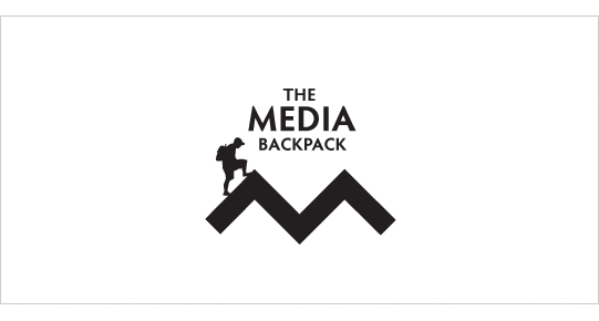
The Media Backpack logo portrays the spirt of the outdoors through the mountain and hiker icons. The hiker is climbing and testing his/her skills to achieve a goal. Similarly, the readers/visitors to The Media Backpack will be educating and testing themselves in order to produce the various media required by their job. They may not have all the skills they need to reach their goal, but the media backpack will be there to help them along their arduous climb.
The clean, hard and angular lines of the ‘m’ icon and mountain compliment the typeface selection. The image of the hiker is a visual stand-in for each and every user of the site as they climb to the top of their virtual mountain.
D&D Studios Logo Concept Rationale

Because D&D Studios is a professional quality recording studio in Nashville, TN primarily targeting churches, young bands/artists that are trying to develop a demo this logo needs to stand out from the competition.
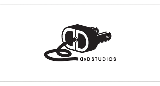
This concept explores the concept of power and electronics and their association to the recording industry. The cord and plug icon is unique and memorable among the competition and creates a playful feel to the mark. The plug icon communicates the concepts of electric or unplugged which are common terms in the music industry. The end of the plug displays the D&D monogram which ties into the “D&D Studios” below. The typography has been selected to be simple and therefore not compete with the icon.Related Article


