Jun 01, 2009 / Erik Peterson
34digg
Color offers an instantaneous method for conveying meaning and message in your logo designs. It’s probably the most powerful non-verbal form of communication we can use as designers. Our minds are programmed to respond to color. The subliminal messages we get from color shape our thoughts. As humans our very survival is hung on the identification of color. We stop our cars for red lights and go on green, we look at the color of certain plants and animals to determine whether or not they are safe for us to eat or touch, the bottom line is that color is a very important part of our daily lives. It’s important for us as designers to use color appropriately and understand the meaning behind the colors we choose.Red
Action, Adventure, Aggressive, Blood, Danger, Drive, Energy, Excitement, Love, Passion, Strength and Vigor
Red is an intense color. It can summon conflicting emotions from blood and warfare to love and passion. It is often used in logo design to grip the viewer’s attention and has been known to raise one’s blood pressure or make people hungry.
Red Bull: 1987 Designer Unknown
Red Bull gets a double dose of red in its logo and is a great color choice for a logo that represents an energy drink company. The company markets the drink as, “Red Bull vitalizes body and mind” and “Red Bull gives you wiiings!”. Both of these phrases reinforce why red was an excellent color choice for the logo. By accenting the red with yellow a loosely analogous color palette is created for the brand.
Pink
Appreciation, Delicate, Femininity, Floral, Gentle, Girly, Gratitude, Innocence, Romantic, Soft and Tranquil
Pink is a feminine color that conjures feelings of innocence and delicateness. It’s a softer version of red that can stir up visions of little girls, bubble-gum and cotton candy. The color pink is also widely associated with breast cancer awareness. It is often used in logos to add a feminine flare.
Barbie: 1959 Designer Unknown
The color pink is very prominent in Mattel’s Barbie logo and supporting branding material. It is a fitting color for a toy that is marketed to little girls. The typeface compliments the color choice and helps to reinforce the brands positioning by giving the impression of a young girl’s handwriting.
Orange
Affordable, Creativity, Enthusiasm, Fun, Jovial, Lighthearted, High-Spirited and Youthful
Orange is made up of red and yellow and can represent attributes from each of those colors. Orange is less intense than red but still packs a lot of punch. It is more playful and youthful than red. You can commonly find it used in logos to create a playfulness or stimulate emotions and even appetites.
Nickelodeon: 1984 Tom Corey, Fred/Alan Inc., Scott Nash
Orange is a perfect color choice for Nickelodeon who’s target audience is children. Orange is fun, lighthearted and youthful which reflects the TV channel’s programing. The design of the Nickelodeon logo supports the youthful theme with the paint spattered backdrop and playful typography.
Yellow
Caution, Cheerful, Cowardice, Curiosity, Happiness, Joy, Playful, Positivity, Sunshine and Warmth
Yellow, much like red, can have conflicting messages. It can represent sunshine and happiness or caution and cowardice. Yellow is bright and highly visible which is why it can often be found on caution and other road signs. Yellow is often used in logo design to get attention, create happiness and warmth.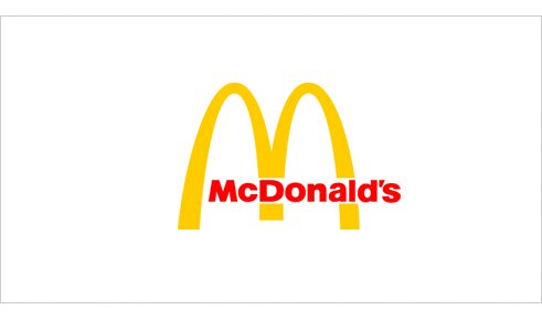
McDonald’s: 1962 Jim Schindler
We all know the successful McDonald’s franchise (aka The Golden Arches) and their slogan “I’m Lovin’ It”. Like Red Bull, McDonald’s uses a loosely analogous color palette. The difference is that McDonald’s is mainly yellow which fitting for this brand that focuses on children, playfulness and happiness. The red works well as an accent color and has been know to raise ones blood pressure and evoke hunger. Incidentally, this color combination has influenced many other fast food chains.
Green
Crisp, Environmental, Fresh, Harmony, Health, Healing, Inexperience, Money, Nature, Renewal and Tranquility
Green represents life and renewal. It is a restful and soothing color but can also represent jealousy and inexperience. You can often find it used in companies that want to portray themselves as eco-friendly. 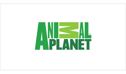
Animal Planet: 2008 Dunning Eley Jones
Green is suitable logo color choice for a TV channel who’s programing focuses solely on nature and animals. There’s a significant amount of controversy surrounding this logo. So whether you like the logo or not, I think we can agree that the various tones of green are right on for this channel. The color conjures up imagery of jungles, grasses and nature in general.
Blue
Authority, Calm, Confidence, Dignity, Established, Loyalty, Power, Success, Secure and Trustworthy
Blue is calming and can stir up images of authority, success and security. Most people can say they like at least one shade of blue. It is probably the most popular color in logo design and can be seen extensively in government, medical and fortune 500 company logos.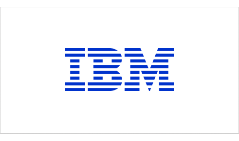
IBM: 1972 Paul Rand
The blue in the IBM (aka “Big Blue”) logo represents a company that is non-threatening yet stable and established. When Rand redesigned the IBM logo he replaced the solid type with 8 horizontal bars to represent “speed and dynamism”. While the logo typically isn’t used in its original blue today, it is still a very prominent color in the IBM brand.
Purple
Ceremony, Expensive, Fantasy, Justice, Mystery, Nobility, Regal, Royalty, Sophistication and Spirituality
Purple implies royalty, mystery, spirituality and sophistication. Because purple is the combination of red and blue, it has both warm and cool properties. The color purple can be found in many education related and luxury product logos.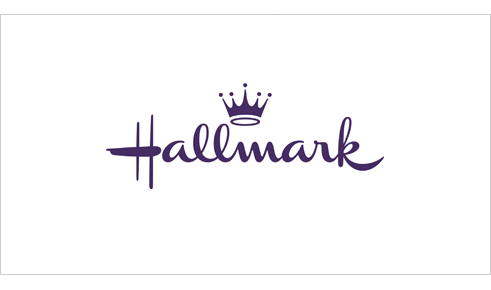
Hallmark: Designer Unknown
The Hallmark company uses the slogan “When you care enough to send the very best.” The use of the color purple in the logo supports the marketing message of the company. It implies royalty, expense and sophistication which is reinforced by the crown icon that hovers over the type.
Brown
Calmness, Depth, Earth, Natural, Roughness, Richness, Simplicity, Serious, Subtle, Utility and Woodsy.
Brown indicates nature, woodiness, and utility. Brown is used in logos related to construction and legal logos due to it simplicity, warmth and neutrality. “What can Brown do for you?” is the tagline for UPS which might be one of the most recognized brown logos.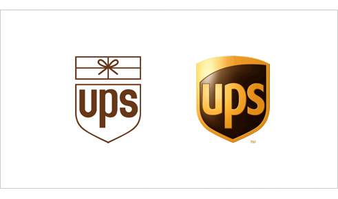
UPS: 1961 Paul Rand and 2003 FutureBrand
UPS uses the color brown to differentiate itself from the competition (i.e., the USPS and FedEx). While the color may be received by many as utilitarian, boring or conservative, UPS has taken ownership of the color and used it as a point of distinction. In the 2003 redesign the introduction of yellow brings some warmth, friendliness and a certain richness to the mark.
Black
Authority, Bold, Classic, Conservative, Distinctive, Formality, Mystery, Secrecy, Serious and Tradition
Black is technically, the absence of all color. It’s a powerful and conjures authority, boldness, elegance and tradition. Black can be found in many logos for its boldness, simplicity and sophistication.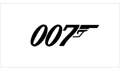
James Bond 007: Designer Unknown (© 1962 Danjaq, LLC and United Artists Corporation)
The James Bond 007 logo is solid black. The color choice for the classic spy movie’s logo works well. The color represents the authority, mystery and sophistication that is a part of 007 movies.
Grey
Authority, Corporate Mentality, Dullness, Humility, Moody, Practicality, Respect, Somberness and Stableness
Grey, is somewhere between black and white. From a moral standpoint, it is the area between good and evil. It is also known as neutral and cool. Grey is often used for the type within logos because it is neutral and works well with most other colors.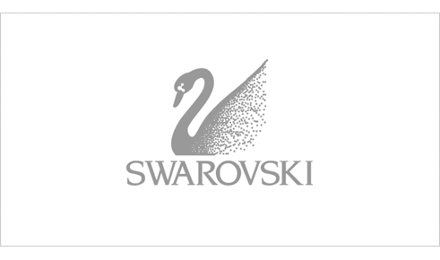
Swarovski Crystal: Designer Unknown
The logo for the luxury brand Swarovski, maker of lead crystal glass, is grey. The grey could be viewed to represent the lead that is a part of the product the company makes, but also represents the respect and authority that comes from the history of a company that has been around for over 100 years.
White
Cleanliness, Innocence, Peace, Purity, Refined, Sterile, Simplicity, Surrender and Truthfulness
White is the universal color of peace and purity. It can often be found in logos as reversed text or negative space.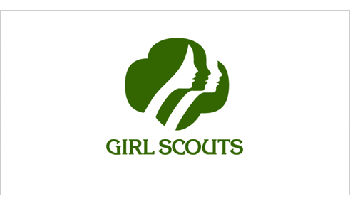
Girl Scouts: 1978 Saul Bass
While green may be the more prominent color in the Girl Scouts logo it also uses the negative space to create the silhouettes of two faces. The combination of the silhouetted faces and the white create a certain purity and innocence in the logo.


