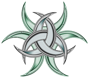
Step 1:
A) Create a new document, 700×700 pixels.
B) Create a New Layer. Using the Elliptical Marquee Tool, create a circle selection that will fill up about a quarter of your canvas space. Be sure to hold shift while making the selection to get a perfectly round circle.

Step 2:
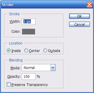
A) Create a New layer. CTRL+Left click on the circle layer to select the circle. Go to EDIT > STROKE. With your settings set to 15px width, color something not black (I used Grey #6E6E6E), Location: Inside, Mode: Normal, Opacity: 100%.
B) Next we will be adding little indents to this grey layer. Refer to this next picture for this step:
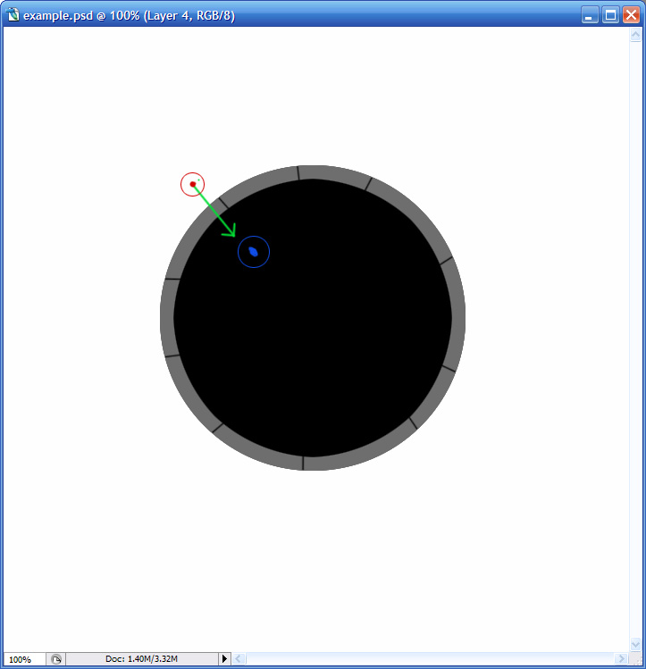
With your Eraser Tool, start outside of the circle, click, hold shift, and click again inside of the circle. This will delete a straight line through the grey layer.
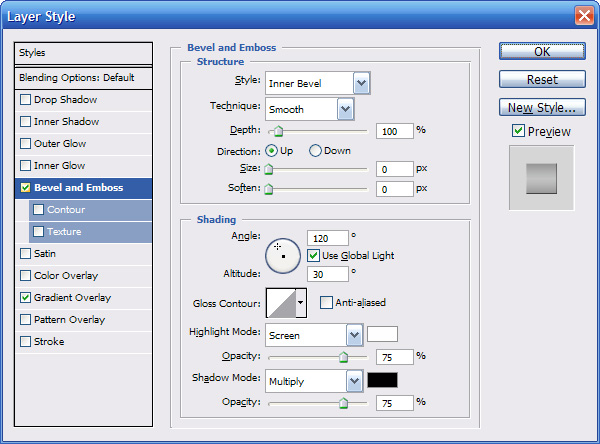
C) Go to your Layer Styles (Layer>Layer Styles). Apply a Bevel and Emboss, a Gradient Overlay and Stroke with these settings:
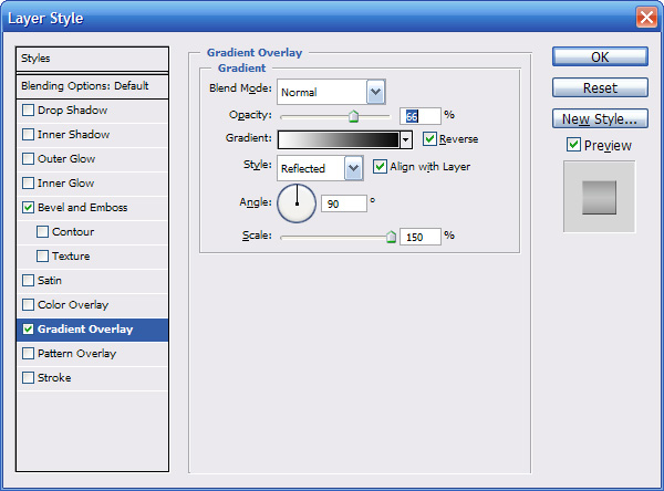
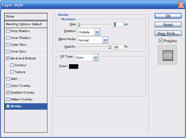
D) With your black circle layer selected, go to your Layer Styles again. Apply a Gradient Overlay with these settings:
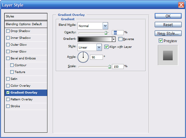
Step 3:
A)
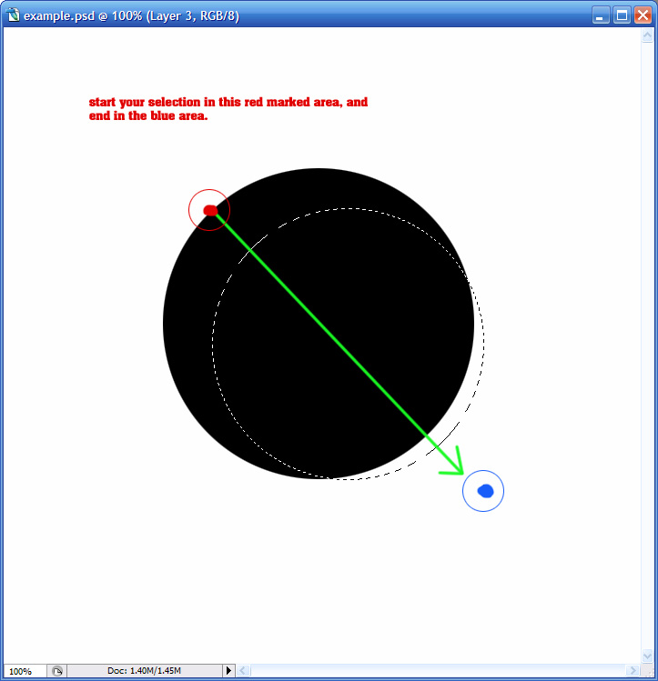
This picture illustrates how to achieve the crescent shape. Using your elliptical marquee tool again, holding shift, start your cursor at the top left of the circles edge, and drag it to the bottom right edge, and then past the edge a bit.
B) Now select your black circle layer and press Delete to clear the selection, producing the crescent shape. Also select the grey outline layer and press delete again.
Create a New Layer under the crescent layer, and the outline layer. Merge the outline layer down into the blank layer, and the black layer down into the blank layer:
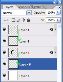
And then merge into one layer.
Step 4:
A) Create a New Layer. CTRL+Left click on your crescent shape. Go to EDIT>STROKE, grey (#828282), 7 pixels. Go to your Layer Styles, and apply a Bevel and Emboss with these settings:
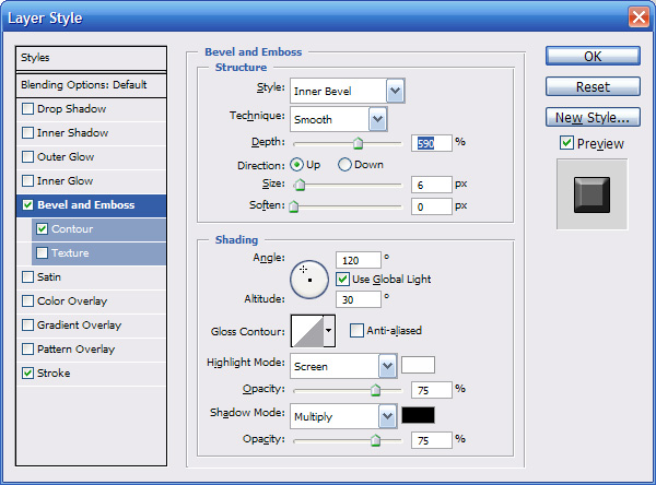
Depending on the size of the circle you made originally, you will have to adjust the size setting. You will want to look at the tips of the crescent when doing this, and make it look similar to mine:

Merge into one layer once again.
Congratulations, you have completed the crescent shape.
Now that we have created the base shape, its time to start creating our logo.
This step I found very hard to explain how to make everything symmetrical, but I tried my best. Here we go.
Step 5:
Create a New Layer. Make a straight line, the length does not matter, just make it longer than your circle. Just make it straight up and down. Duplicate your line layer, and Go to Edit>Transform>Rotate. At the top, there is a place where you can type in how many degrees you want to rotate:

Rotate 120 degrees. Duplicate this rotated line, and go to EDIT>TRANSFORM> FLIP HORIZONTAL. Position these 2 sticks in this formation:
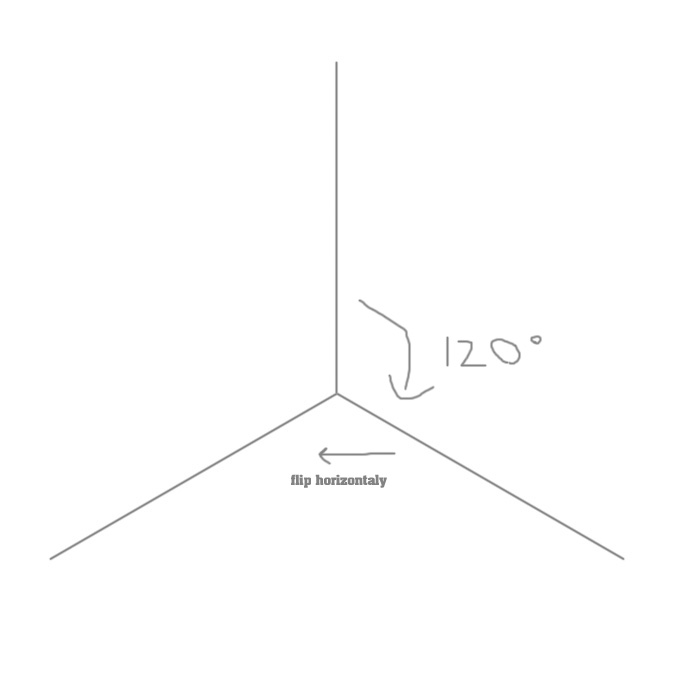
Merge all 3 sticks together once you have positioned them right.
These will only serve as a template so that our crescents will be positioned right.
Step 6:
Create a new layer, and create a horizontal stick. We will use this stick to position our crescent correctly.
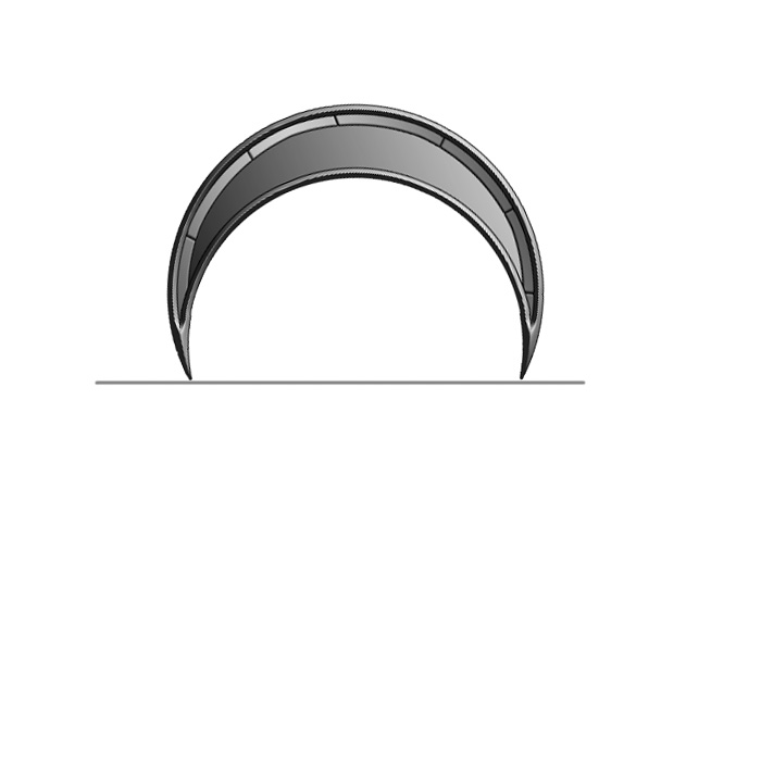
After you have rotated your crescent to be strait, you can delete the horizontal stick.
Step 7:
Duplicate your crescent layer, and rotate it 120 degrees like you did to that stick in the previous step. Position this crescent in the top left portion of our template. Duplicate the second crescent, and rotate it 120 degrees again, and position it in the top right portion:
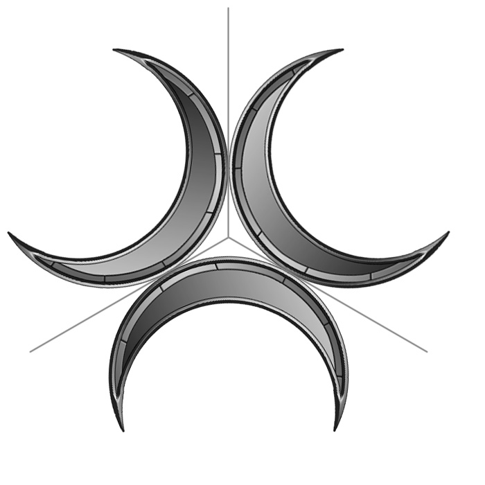
Step 8:
I would now suggest creating a new group, and placing these 3 crescents in there (CTRL+G). Duplicate any one of the crescents. Put your 3 crescents inside this new group, but leave your duplicated one out. Duplicate this crescent, and rotate it 120 degrees. Duplicate again and rotate 120 degrees again. Position these 3 crescents like so:
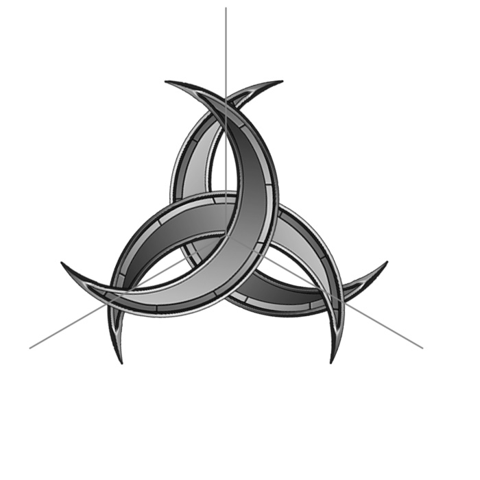
Step 9:
To make it look like the 3 crescents are weaving in and out of each other, CTRL+Left click on the bottom crescent so you have a selection around it. Click on the top most layer, and press Delete. And now you have them weaving thorough each other.
Step 10:
Merge your 3 crescents together into one layer. Rotate them 60 degrees.
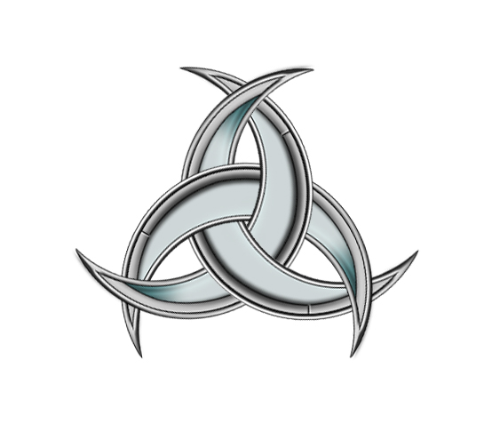
And there you have it, a fairly simple to create, yet complex looking logo. You may choose to add color to the crescents. Or if you’re feeling bold, integrate worn and broken effects to the crescents.
Here is a few variants I have included:
With the back crescents colored:Related Article


