Wednesday, June 29, 2011

What Makes a Great Logo Design

Apr 30, 2009 / Erik Peterson


What Makes a Great Logo Design?


A logo, trademark, emblem, brand, logotype, symbol, identity, mark, insignia represents a company to consumers. It gets its meaning from the company it represents, not the other way around. It’s effectiveness can help to sell a product or service to the public. It’s the identifier that consumers sometimes attach themselves to and become loyal to. It’s a visual expression of a company, product or service. The role of the logo is to point or designate in the simplest form possible.

There are five elements that you can find in great and successful logo designs. Most of the logos you know and love will meet all these criteria. When you think of a great logo what brands come to mind? Remember the logos for those brands as you read through this article and see if they meet the five criteria.

Distinctive

Consumers need to be able to recognize a logo. Therefore, a great logo must be distinct, easy to read and understand. The logo should be unique enough to avoid confusion with other companies’ logos. The logo needs to represent the company it stands for so that consumers may associate it with the business each time they see it.
American Airlines Logo

The American Airlines logo, designed by Vignelli Associates in 1967, meets all of the criteria we’ll be discussing in this article. The AA logo is instantly recognizable with it’s AA monogram and eagle icon.

Did you know? The redesign of the AA monogram in the 1960’s didn’t include the eagle. After the employees protested, the designer reluctantly added the stylized eagle that we know today as part of the AA monogram.
Useable

Since, a logo is used across many different mediums, from letterhead and business cards to websites and sales materials to pens and clothing. A good logo must be flexible enough to work in any situation/medium required. In order to meet these demands, a logo should work well in black and white and in color. From a size standpoint, a logo should be simple enough to look good on a business card, yet intriguing enough to work on a large poster or even billboard.
FedEx Logo

The FedEx logo was designed by Lindon Leader, in 1994 working as a Senior Design Director at Landor Associates. The logo is bold, scales well and works in all mediums.

Did you know? Many people don’t notice the clever arrow within the negative space of the ‘e’ and ‘x’ at first glance.
Timeless

To be effective, a logo should stay with the business as it grows. The belief that a new or redesigned logo will somehow transform a business, isn’t uncommon. But a business shouldn't go around changing their logo on a whim. This can weaken the company brand after all of the work a company has put into it. A well-designed logo will persevere for years to come.
Coca-Cola Logo

The Coca-Cola logo, designed by Frank Robinson in 1886, is a prime example of a great and timeless logo.

Did you know? Coca-Cola has one the best recognized logos in the world today, and is recognized in over 200 countries around the world.
Effective without color

A good logo not only needs to work in black and white, but it should also still be effective. If color is needed to communicate the message then perhaps too much emphasis has been place on it.
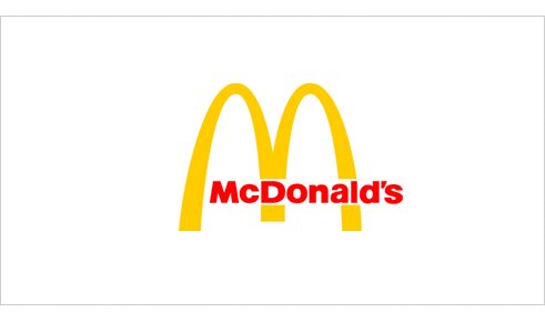
McDonalds Logo

The McDonald’s logo was created by Jim Schindler in 1962. Even though it’s commonly referred to as “The Golden Arches” the logo works very well without the gold color.

Did you know? The idea of the arches was inspired by the arch shaped signs on either side of the ‘walk-up hamburger stand’. From an angle, the arches looked like the letter “M”. The “McDonald’s” name was later added to the McDonald’s logo in 1968.
Memorable

Your logo should make a statement about your company. It should be engrained in the consumers brain when think of your industry. Therefore, the next time a consumer needs your kind of product or service, you’ll be the fist to come to mind just because of brand recognition.
American Broadcasting Company Logo

The American Broadcasting Company logo designed by Paul Rand in 1962 simplified the logo to a circle with the letters ‘abc’ inside. This achieved a memorable and unique image. This logo is still in use today, though it has been mostly replaced with a glossy version of the original designed by Rand.

In his 1991 article, Logos, Flags, and Escutcheons Paul Rand said,

“Design, good or bad, is a vehicle of memory. Good design adds value of some kind and, incidentally, could be sheer pleasure; it respects the viewer-his sensibilities-and rewards the entrepreneur. It is easier to remember a well designed image than one that is muddled. A well design logo, in the end, is a reflection of the business it symbolizes. It connotes a thoughtful and purposeful enterprise, and mirrors the quality of its products and services.”

The bottom line is that creating a logo requires a lot of planning, time, thought and often times, money. The meaning behind the design should embrace the mission and image of the company, not the other way around. The effectiveness of these marks are such a key part of brands today’s fast paced world. Ultimately, the role of the logo is to point or identify to the consumer in the simplest form possible.
Read more »»  

LOGO Design, Vol. 2 Book Review

Jun 11, 2009 / Erik Peterson

LOGO Design, Vol. 2 Book Review
4digg
The latest logo design book from TASCHEN, entitled LOGO Design, Vol. 2, just arrived at my office on Tuesday. It is a follow-up to the popular first volume entitled LOGO Design, Vol. 1. The book contains around 2000 logos and 13 case studies, in 3 languages (English, French and German), on brand identity for companies like Burton, Wrangler and MTV. The featured design firms include Stefan Sagmeister, MetaDesign, Saffron Brand Consultants, BlackbeltMonkey and others. In the foreword Uli Mayer-Johanssen, of MetaDesign, talks about Brands and Identity.
“Brands that communicate an idea, a purpose, and a clear promise together with technical and rational aspects almost always have something in common with the values and attitudes people have” - Uli Mayer-Johanssen


LOGO Design, Vol. 2

Publisher: TASCHEN America LLC (May 1, 2009)
Editor: Julius Wiedemann
Size: 6.6 x 8.9 x 1.25 in.
Page Count: 384 pages
Cover: Softcover + elastic band


I like the size of the book (kinda like a handbook) and it feels good in my hands when browsing through it. The cover is really hefty for a softcover and the pages are thick as well. There is a neat little elastic band (similar to what you would find on a Moleskine) that holds the book closed. LOGO Design, Vol. 2 is well put together and organized in a logical way, though a bit more whitespace surrounding the individual logos would have been nice. The publisher didn’t cut corners in the production of this book, its materials are top-notch.

Case Studies

There are 13 case studies in the book from various design firms, both in-house and outside agencies. While it is nice to read about the thoughts of the designers in regards to the design process, the meaning of elements and so on, I wish there was more shown from the earlier stages of the projects. I often find seeing sketches and notes from those early stages to be insightful and motivating. Nonetheless, the case studies are still thoughtful and worthwhile. I found the interview with Stefan Sagmeister on the custom logo generator for Casa Da Música to be rather interesting.
Here are a couple of photos from the Burton Outwear case study section with Dave Kinsey of Blk/Mrkt.

Burton Case Study

Burton Case Study

Burton Case Study

Logo Collection

The logo section is categorized into 9 different categories with around 2000 logos. The categories are:
  • Creative Industry
  • Events & Entertainment
  • Fashion & Apparel
  • Institutions, Government & Regional
  • Media
  • Music
  • Retailers & Food Outlets
  • Service & Business
  • Miscellaneous
In this section you’ll see logos from many firms you know as well as many you don’t (Pentagram, Stereo, ImagenAB, Landor & Associates, Logoholik, FutureFarmers, Push, Hula+Hula and many more). The work is a truly an international look at logos and identity. Here are few photos from the various categories.

LOGO Design, Vol. 2 logo page

LOGO Design, Vol. 2 logo page

LOGO Design, Vol. 2 logo page

LOGO Design, Vol. 2 logo page

LOGO Design, Vol. 2 logo page

LOGO Design, Vol. 2 logo page 
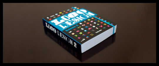
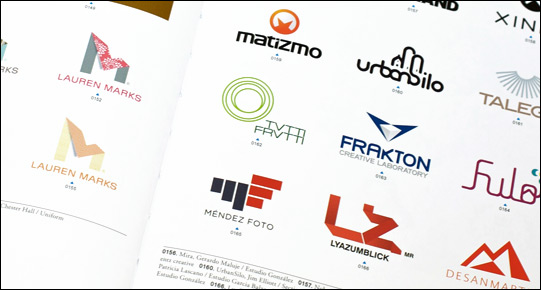
If you’re a designer that works on logos occasionally or quite regularly, this book would be a nice addition to your library. The book sells for about $27 and you can purchase the
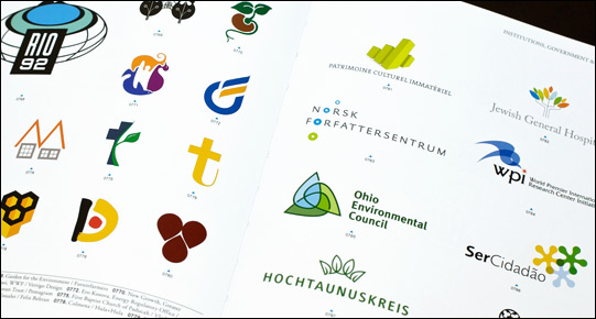
 LOGO Design, Vol. 2 at Amazon.
Read more »»  

How to Write a Logo Rationale

Sep 15, 2009 / Erik Peterson

How to Write a Logo Rationale
5digg
When presenting logo concepts to a client it is often productive to have written rationales to accompany each concept. This can help you, the designer, clarify your thoughts before getting the concepts in front of your client. The rationales will help your client to better understand the concepts from your point of view (especially if you are not there in person to present the concepts to your client). In turn, this will help your client make an educated decision when picking their final logo. All that effort will also help you to better defend and explain concerns and questions that may arise during the logo revision process.
Here are some topics to consider covering when in your writing rationales. In going through this process you may even see some areas for improvement in your concepts. If possible, run your draft rationales by a non-designer and get their feedback.
  1. Symbolism: Clarify and identify the meanings behind the icons you chose to incorporate into the design. Go into as much detail as you feel necessary, the history, cultural relevance and so on.
  2. Style: Why did you choose this style for the logo? Did you give it a distressed look because the mark is for an outdoors company, or is the logo clean and orderly because it’s for a closet organization company, etc.
  3. Typography: Explain why you chose the typefaces used in the logo. How do they relate to the rest of the design and the company it represents?
  4. Relationship: How does the concept relate to the company’s personality, goals, vision and values? Hopefully you learned a lot about the company in your creative brief process. You can read more about creative briefs in the article “The Creative Brief: Questions to Ask Before Designing a Logo”.
  5. Color: Explain the color choices. Why did you choose them? What does the color represent? How does the color choice relate to the business? Sometimes color isn’t a part of the first round of concepts, so whenever color is does get introduced it’s important to add it to your rationale. You can read more about color psychology here in the article “Color Psychology in Logo Design”.
A written rationale is a good tool for communication but don’t forget to listen to your client. Make sure you hear their opinions and questions. You likely know a lot more about design than your client, but they know their target audience and company better than you. Translate those ideas into an understanding of what those people’s problems really are. In other words So when your client says “Can we add x to the logo?” take the time to understand what it is that they are trying to accomplish with their request.

Rationale Examples

I thought it would be useful to see show some examples of rationales I have written for various logo concepts I’ve have presented to clients.

The Media Backpack Logo Concept Rationale

The Media Backpack Logo Design Concept
The Media Backpack logo portrays the spirt of the outdoors through the mountain and hiker icons. The hiker is climbing and testing his/her skills to achieve a goal. Similarly, the readers/visitors to The Media Backpack will be educating and testing themselves in order to produce the various media required by their job. They may not have all the skills they need to reach their goal, but the media backpack will be there to help them along their arduous climb.
The clean, hard and angular lines of the ‘m’ icon and mountain compliment the typeface selection. The image of the hiker is a visual stand-in for each and every user of the site as they climb to the top of their virtual mountain.

D&D Studios Logo Concept Rationale

D&D Studios Logo Design Concept
Because D&D Studios is a professional quality recording studio in Nashville, TN primarily targeting churches, young bands/artists that are trying to develop a demo this logo needs to stand out from the competition.
This concept explores the concept of power and electronics and their association to the recording industry. The cord and plug icon is unique and memorable among the competition and creates a playful feel to the mark. The plug icon communicates the concepts of electric or unplugged which are common terms in the music industry. The end of the plug displays the D&D monogram which ties into the “D&D Studios” below. The typography has been selected to be simple and therefore not compete with the icon.
Read more »»  

Color Psychology in Logo Design

Jun 01, 2009 / Erik Peterson

Color Psychology in Logo Design
34digg
Color offers an instantaneous method for conveying meaning and message in your logo designs. It’s probably the most powerful non-verbal form of communication we can use as designers. Our minds are programmed to respond to color. The subliminal messages we get from color shape our thoughts. As humans our very survival is hung on the identification of color. We stop our cars for red lights and go on green, we look at the color of certain plants and animals to determine whether or not they are safe for us to eat or touch, the bottom line is that color is a very important part of our daily lives. It’s important for us as designers to use color appropriately and understand the meaning behind the colors we choose.

Red

Action, Adventure, Aggressive, Blood, Danger, Drive, Energy, Excitement, Love, Passion, Strength and Vigor
Red is an intense color. It can summon conflicting emotions from blood and warfare to love and passion. It is often used in logo design to grip the viewer’s attention and has been known to raise one’s blood pressure or make people hungry.
Red Bull Logo
Red Bull: 1987 Designer Unknown
Red Bull gets a double dose of red in its logo and is a great color choice for a logo that represents an energy drink company. The company markets the drink as, “Red Bull vitalizes body and mind” and “Red Bull gives you wiiings!”. Both of these phrases reinforce why red was an excellent color choice for the logo. By accenting the red with yellow a loosely analogous color palette is created for the brand.

Pink

Appreciation, Delicate, Femininity, Floral, Gentle, Girly, Gratitude, Innocence, Romantic, Soft and Tranquil
Pink is a feminine color that conjures feelings of innocence and delicateness. It’s a softer version of red that can stir up visions of little girls, bubble-gum and cotton candy. The color pink is also widely associated with breast cancer awareness. It is often used in logos to add a feminine flare.
Barbie Logo
Barbie: 1959 Designer Unknown
The color pink is very prominent in Mattel’s Barbie logo and supporting branding material. It is a fitting color for a toy that is marketed to little girls. The typeface compliments the color choice and helps to reinforce the brands positioning by giving the impression of a young girl’s handwriting.

Orange

Affordable, Creativity, Enthusiasm, Fun, Jovial, Lighthearted, High-Spirited and Youthful
Orange is made up of red and yellow and can represent attributes from each of those colors. Orange is less intense than red but still packs a lot of punch. It is more playful and youthful than red. You can commonly find it used in logos to create a playfulness or stimulate emotions and even appetites.
Nickelodeon Logo
Nickelodeon: 1984 Tom Corey, Fred/Alan Inc., Scott Nash
Orange is a perfect color choice for Nickelodeon who’s target audience is children. Orange is fun, lighthearted and youthful which reflects the TV channel’s programing. The design of the Nickelodeon logo supports the youthful theme with the paint spattered backdrop and playful typography.

Yellow

Caution, Cheerful, Cowardice, Curiosity, Happiness, Joy, Playful, Positivity, Sunshine and Warmth
Yellow, much like red, can have conflicting messages. It can represent sunshine and happiness or caution and cowardice. Yellow is bright and highly visible which is why it can often be found on caution and other road signs. Yellow is often used in logo design to get attention, create happiness and warmth.
McDonald's Logo
McDonald’s: 1962 Jim Schindler
We all know the successful McDonald’s franchise (aka The Golden Arches) and their slogan “I’m Lovin’ It”. Like Red Bull, McDonald’s uses a loosely analogous color palette. The difference is that McDonald’s is mainly yellow which fitting for this brand that focuses on children, playfulness and happiness. The red works well as an accent color and has been know to raise ones blood pressure and evoke hunger. Incidentally, this color combination has influenced many other fast food chains.

Green

Crisp, Environmental, Fresh, Harmony, Health, Healing, Inexperience, Money, Nature, Renewal and Tranquility
Green represents life and renewal. It is a restful and soothing color but can also represent jealousy and inexperience. You can often find it used in companies that want to portray themselves as eco-friendly.
Animal Planet Logo
Animal Planet: 2008 Dunning Eley Jones
Green is suitable logo color choice for a TV channel who’s programing focuses solely on nature and animals. There’s a significant amount of controversy surrounding this logo. So whether you like the logo or not, I think we can agree that the various tones of green are right on for this channel. The color conjures up imagery of jungles, grasses and nature in general.

Blue

Authority, Calm, Confidence, Dignity, Established, Loyalty, Power, Success, Secure and Trustworthy
Blue is calming and can stir up images of authority, success and security. Most people can say they like at least one shade of blue. It is probably the most popular color in logo design and can be seen extensively in government, medical and fortune 500 company logos.
IBM Logo
IBM: 1972 Paul Rand
The blue in the IBM (aka “Big Blue”) logo represents a company that is non-threatening yet stable and established. When Rand redesigned the IBM logo he replaced the solid type with 8 horizontal bars to represent “speed and dynamism”. While the logo typically isn’t used in its original blue today, it is still a very prominent color in the IBM brand.

Purple

Ceremony, Expensive, Fantasy, Justice, Mystery, Nobility, Regal, Royalty, Sophistication and Spirituality
Purple implies royalty, mystery, spirituality and sophistication. Because purple is the combination of red and blue, it has both warm and cool properties. The color purple can be found in many education related and luxury product logos.
Hallmark Logo
Hallmark: Designer Unknown
The Hallmark company uses the slogan “When you care enough to send the very best.” The use of the color purple in the logo supports the marketing message of the company. It implies royalty, expense and sophistication which is reinforced by the crown icon that hovers over the type.

Brown

Calmness, Depth, Earth, Natural, Roughness, Richness, Simplicity, Serious, Subtle, Utility and Woodsy.
Brown indicates nature, woodiness, and utility. Brown is used in logos related to construction and legal logos due to it simplicity, warmth and neutrality. “What can Brown do for you?” is the tagline for UPS which might be one of the most recognized brown logos.
UPS Logo
UPS: 1961 Paul Rand and 2003 FutureBrand
UPS uses the color brown to differentiate itself from the competition (i.e., the USPS and FedEx). While the color may be received by many as utilitarian, boring or conservative, UPS has taken ownership of the color and used it as a point of distinction. In the 2003 redesign the introduction of yellow brings some warmth, friendliness and a certain richness to the mark.

Black

Authority, Bold, Classic, Conservative, Distinctive, Formality, Mystery, Secrecy, Serious and Tradition
Black is technically, the absence of all color. It’s a powerful and conjures authority, boldness, elegance and tradition. Black can be found in many logos for its boldness, simplicity and sophistication.
james Bond 007 Logo
James Bond 007: Designer Unknown (© 1962 Danjaq, LLC and United Artists Corporation)
The James Bond 007 logo is solid black. The color choice for the classic spy movie’s logo works well. The color represents the authority, mystery and sophistication that is a part of 007 movies.

Grey

Authority, Corporate Mentality, Dullness, Humility, Moody, Practicality, Respect, Somberness and Stableness
Grey, is somewhere between black and white. From a moral standpoint, it is the area between good and evil. It is also known as neutral and cool. Grey is often used for the type within logos because it is neutral and works well with most other colors.
Swarovski Logo
Swarovski Crystal: Designer Unknown
The logo for the luxury brand Swarovski, maker of lead crystal glass, is grey. The grey could be viewed to represent the lead that is a part of the product the company makes, but also represents the respect and authority that comes from the history of a company that has been around for over 100 years.

White

Cleanliness, Innocence, Peace, Purity, Refined, Sterile, Simplicity, Surrender and Truthfulness
White is the universal color of peace and purity. It can often be found in logos as reversed text or negative space.
Girl Scouts Logo
Girl Scouts: 1978 Saul Bass
While green may be the more prominent color in the Girl Scouts logo it also uses the negative space to create the silhouettes of two faces. The combination of the silhouetted faces and the white create a certain purity and innocence in the logo.
As you can see these colors can be found in logos we know and recognize. Often the designer has considered the meaning of the colors when choosing the palette for the logo. Next time you’re designing a logo remember to ponder the meaning of the colors you choose and do so wisely. Just remember, color psychology consists of culturally created ties that can change over time and location. It is by no means an exact science and is still largely based on anecdotal evidence.
Read more »»  

DESIGN YOUR LOGO LIKE A PRO

Written by Eileen Parzek, Net Profit Magazine, © 1997

A logo is the image which represents a company or its product. It's function is to create a memorable, recognizable impression on the mind of a potential client or customer. A logo is essentially at the heart of a corporate identity.
So what makes a "good" logo? Most people would answer "I just know it when I see it!" and this isn't so far from the truth. A good logo catches the eye - it makes the observer curious or engaged, if only for a short moment. A moment in which an image and the existence of your company is embedded in the mind rather than filtered out with a million other daily stimuli. But even if a good logo 'just is', there are elements for making it happen and we will look at some of those.
There are three basic types of logos, which can be used alone or combined within one design:
  • illustrative logos (a logo which clearly illustrates what your company does),
  • graphic logos (a logo that includes a graphic, often an abstraction, of what your company does), and
  • font-based logos (a text treatment which represents your company)
Creating a logo is always a process - though different designers have their own methods. Many designers will begin by sketching thumbnails or playing with shapes on the computer screen, until something "clicks" and they follow that path to see where it leads. One way to start is to select a shape which represents the concept of the company, and begin playing with it. The idea is to come up with something interesting or clever, whether a viewpoint which is different, or an unusual combination of shapes. Perhaps it will be something which will require some guesswork on the part of the viewer, but then be crystal clear when they look at it another way.
Many designers prefer to developing logos beginning with, or consisting entirely of text. By experimenting with fonts, size, shapes they seek to find an interesting way to represent the company using the form of letters. Again, simplicity is extremely important - this is not the time to use fancy decorative fonts. Whether alone or combined with graphic elements, the text in a logo must be easily readable at small sizes.
Once a form for the logo has been defined, color needs to be considered. Again, color for a logo should remain simple. You can always get fancy with the web version, but a good logo must work well in one color and gradients of that color. The color should enhance and support the form of the logo - for example, various shades of blue on the sides of a 3D box should be the same as they would in real life. If you are planning on printing many logo prototypes, use the draft mode on your printer in order to save on ink or toner.
Contrast is another powerful concept in the creation of logos - you can contrast size, color, fonts, textures - to create visual interest.
A logo should be simple and abstract, not be complicated or confusing, and again, all elements must be discernible when reproduced in small sizes.
Read more »»  

logo maker software free download

Free Logo Maker Software Free Download Download Free Logo Design Studio,

Free Logo Maker Software Free Download Download Free Logo Design Studio,

e-books-creation Free Software Downloads and Reviews

e-books-creation Free Software Downloads and Reviews

Free Logo Maker Software. The good news is that Greenbox LogoMaker 2.0 is

Free Logo Maker Software. The good news is that Greenbox LogoMaker 2.0 is

 Logo Maker for free download. This is available only

Logo Maker for free download. This is available only

Logosmartz Online Custom Logo Maker and Designer Software Company - Make

Logosmartz Online Custom Logo Maker and Designer Software Company - Make

Free Logo Design Software Free Download

Free Logo Design Software Free Download

Download LogoMaker 2 , free logo design software

Download LogoMaker 2 , free logo design software

Free Logo Design – Logo Maker. Free logo maker software.

Free Logo Design – Logo Maker. Free logo maker software.

The Logo Creator 5.2 Free Download and Software Reviews

The Logo Creator 5.2 Free Download and Software Reviews

The Logo Creator is a logo design software for Windows. Download 38.50MB

The Logo Creator is a logo design software for Windows. Download 38.50MB

 will be still active so you can download the Logo Maker software without

will be still active so you can download the Logo Maker software without

Logo Creator free download of unlock key serial number (1)

Logo Creator free download of unlock key serial number (1)

Making a free logo design using the best free logo maker software on the

Making a free logo design using the best free logo maker software on the

Portable Sothink Logo Maker 2.0.b205 ENG

Portable Sothink Logo Maker 2.0.b205 ENG

Logosmartz Online Custom Logo Maker and Designer Software Company - Make

Logosmartz Online Custom Logo Maker and Designer Software Company - Make

Best Logo Design Software | Logo Maker Software | Logo Design …

Best Logo Design Software | Logo Maker Software | Logo Design …

Logo maker is innovative and easy to use program to create design logos and

Logo maker is innovative and easy to use program to create design logos and

With The Logo Creator logo design software - youll get a portfolio full of

With The Logo Creator logo design software - youll get a portfolio full of

Free Download Logosmartz Logo Maker Software for Windows 7

Free Download Logosmartz Logo Maker Software for Windows 7

free download laughing bird software · free download laughingbird the logo

free download laughing bird software · free download laughingbird the logo
Read more »»